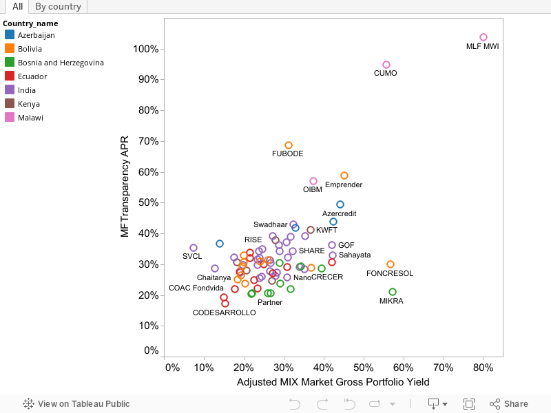
Update: check the MIX's improved version of this analysis.Yesterday I posted a graphic showing the distribution of microcredit interest rates. As I explained, the "interest rates" there are actually gross portfolio yields, ratios of incoming interest to outstanding debt stock reported by about 1,000 microcreditors to the Mix Market. Analysts have often used this variable to proxy for the interest rate for lack of anything better. It has serious limitations. For example, it leaves out the cost of savings that may be required along with the borrowing (where the savings earn a lower interest rate than the credit charges), the cost of mandatory of often overpriced credit-life insurance, and perhaps certain fees.I realized that since I made the first version of that graph for chapter 7, a new and rich data set has become available that measures the cost of microcredit in great detail in a number of countries. It comes of course from from MFTransparency. Their methods produce many numbers for each creditor because creditors offer different types of loans, with different terms, and because the exact cost of credit usually depends on the size of the loan.These interest rate measurements, most of which were rolled out within the last year, provide an interesting check on the Mix Market portfolio yield numbers. Are the GPY numbers grossly misleading if interpreted as measures of the cost of microcredit? In particular do MFTransparency findings overturn the message of yesterday's graph, that the median microcredit interest rate after adjusting for inflation is generally below 30%, which overall doesn't seem so bad? (Blog post title aside, there is no contention here, just two different measures understood by everyone to mean different things.)I matched up the two data sets as well as I could. I found 77 creditors in both data sets (and an impressive number in one but not both). They are in the 7 countries with public MFTransparency data: Azerbaijan, Bolivia, Bosnia & Herzegovina, Ecuador, India, Kenya, and Malawi. To aggregate MFTransparency's detailed data about each creditor, I took the median sample loan size tested for each loan product, then averaged across loan products weighting by the number of clients for each product.In 54 of the 77, the Mix portfolio yield, despite being adjusted slightly up for loan losses, as mentioned yesterday, is indeed lower than the APR. But on average it was only 9% (not 9 percentage points) lower. Looking across countries, the two measures clearly move together; both are very high in Malawi. But within countries, notably India, the correlation is much weaker. That is certainly consistent with the idea that MFTransparency is picking up a lot more information.Overall, it looks like portfolio yield unsurprisingly underestimates the cost of microcredit. I will note that in chapter 7. Fortunately, the underestimate does not appear large on average.Inspired by a comment last night from Scott Gaul at the Mix, I tried my hand at Tableau to produce this interactive graph. I must say, Tableau is impressive, though my graphic is hardly a good advertisement for it. Under the All tab just below, if you mouse near the country list, a highlighter icon (![]() ) appears; click on it and then click countries to highlight just their dots on the graph. Or click the "By country" tab to page through the same data.
) appears; click on it and then click countries to highlight just their dots on the graph. Or click the "By country" tab to page through the same data.
Disclaimer
CGD blog posts reflect the views of the authors, drawing on prior research and experience in their areas of expertise. CGD is a nonpartisan, independent organization and does not take institutional positions.