A quarter-century after the empirical growth literature set out to explain why poor countries aren’t catching up with rich ones, cross-country regressions have mercifully gone out of fashion. But in the interim, the core facts have changed.
In a forthcoming survey article in the Journal of Economic Literature, Paul Johnson and Chris Papageorgiou ask “What Remains of Cross-Country Convergence?” Their answer seems to be, “not much.” The abstract reads, in its entirety:
We examine the record of cross-country growth over the past 50 years and ask if developing countries have made progress on closing income gap between their per capita incomes and those in the advanced economies. We conclude that, as a group, they have not and then survey the literature on absolute convergence with particular emphasis on that from the last decade or so. That literature supports our conclusion of a lack of progress in closing the income gap between countries. We close with a brief examination of the recent literature on cross-individual distribution of income which finds that, despite the lack of progress on cross country convergence, global inequality has tended to fall since 2000. [emphasis added]
Ever since Lant Pritchett’s (1997) seminal paper, “Divergence, Big Time”—which pointed out that from a long-term historical perspective, there’s no doubt today’s rich countries have pulled away from poor ones—the view has become deeply entrenched that economic growth has been characterized by the lack of unconditional convergence amongst countries. It is true that on average and without taking account of any growth determinants, since 1960 poorer countries have not grown faster than richer ones. It is this departure of reality from the prediction of Solow’s famous growth model that launched (via Barro (1991)) cross-country growth empirics: the breathless academic trawl—spawning a sub-discipline for a decade or so until the randomista revolution drove it into retreat—for any and all factors that might explain cross-country growth performance.
We’re not here to defend (or attack) the Solow model. We simply want to point out that while economists were busy refining the econometric tools for studying divergence, the basic facts about economic growth around the world turned completely upside down a quarter century ago—and the literature doesn’t seem to have noticed.
While the Johnson-Pageorgiou review notes in passing that “[s]ince the early 1990s the pace of growth of income per capita in many developing economies has accelerated to unprecedented levels and is substantially above that in high income countries,” it goes on to perpetuate the pessimistic no-unconditional convergence view, even and especially drawing on literature for the recent past (see emphasized text above). But this view is plain wrong. While unconditional convergence was singularly absent in the past, there has been unconditional convergence, beginning (weakly) around 1990 and emphatically for the last two decades.
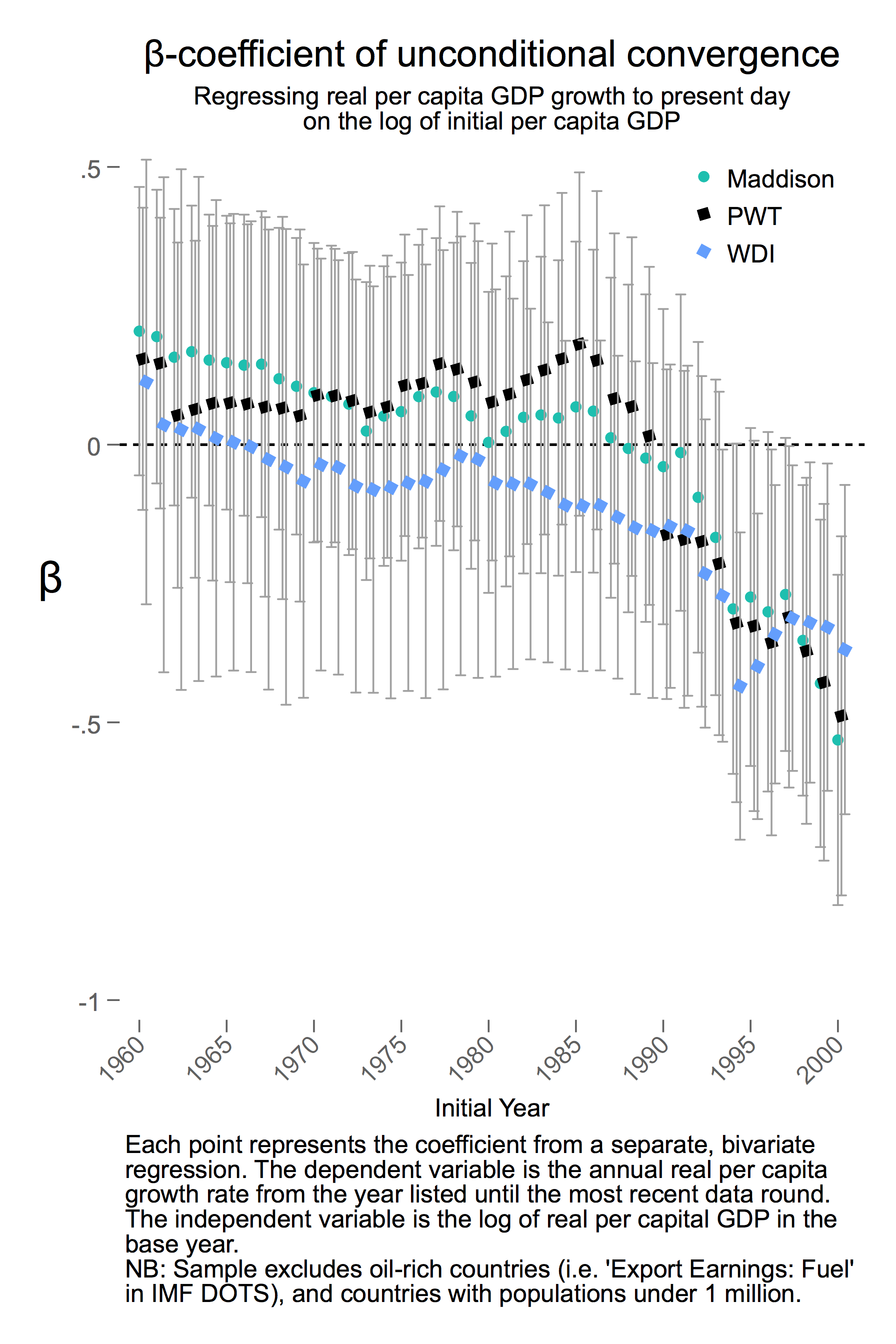
The figure above plots the coefficient (“beta”) from the plain vanilla unconditional convergence regression (relating average growth of real per capita GDP over the long run to its initial level). A statistically significant negative beta denotes convergence and divergence otherwise. Since we know from Johnson et al. (2013) that growth rates vary widely across datasets, we plot the annual betas for three such sets: the Penn World Tables (PWT), the World Development Indicators, and the Maddison Project (Bolt et al. 2014).[1] While the point estimates vary across datasets, the consistent pattern across them all is a statistically significant negative beta since around 1995 (unconditional convergence) and its lack prior to that (see also Roy, Kessler and Subramanian, 2016).
Our basic point doesn’t require regressions. Looking at the 43 countries the World Bank classified as “low income” in 1990, 65 percent have grown faster than the high-income average since 1990. The same is true for 82 percent of the 62 middle-income countries circa 1990.[2]
The conclusion of the empirical growth literature in the 1990s was that convergence was conditional on poor countries achieving the level of human capital and governance in rich countries—economists’ standard “all else equal” fudge. But as Dowrick and Delong (2003) noted, this was an absurd thought experiment. Bangladesh can’t become Belgium overnight. Thankfully it didn’t have to. Instead, developing countries have managed to grow faster without such radical changes in their endowments or institutions.
To be fair to the Johnson and Papageorgiou paper, they quickly move beyond the simple unconditional convergence specification to focus on other models that may explain the data better, with special emphasis on the idea of “convergence clubs.” Our argument here is not that a simple linear model is better, just that inasmuch as commentators have been captivated by the beta-coefficient as a single summary statistic of the evolution of global incomes, it seems important to note its sign has flipped.
Two further facts are worth highlighting.
-
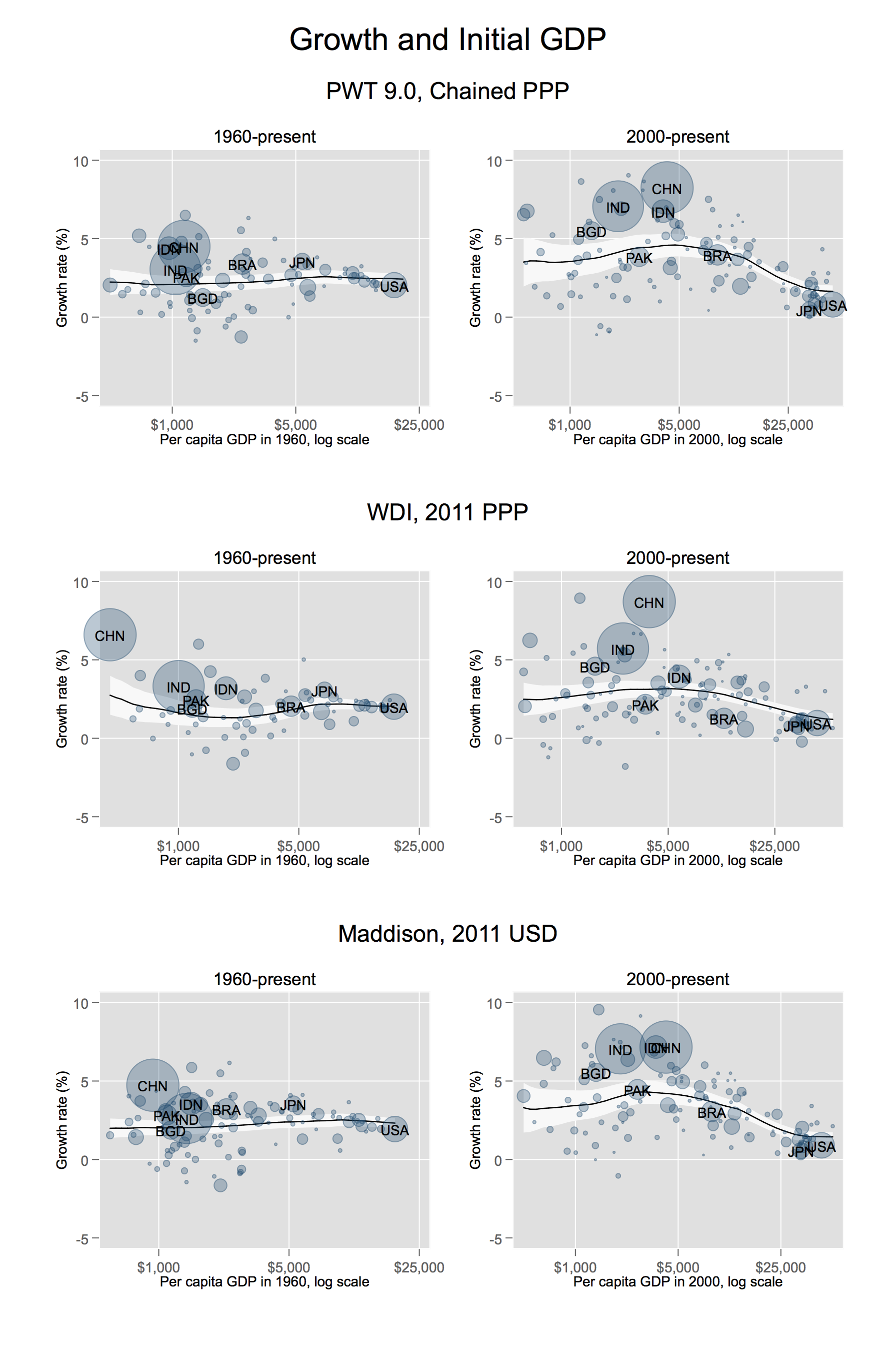
Convergence isn’t just about the growth slowdown in rich countries. Skeptics might assert that the post-1990s convergence is a reflection of worsening performance in the OECD, rather than improving poor country performance. In the figure below, we plot the relationship between growth and initial GDP for two time periods: 1960–2015 and 2000–2015. In both, the lines are the local polynomial regressions, without population weights (which would only exaggerate our point, given China and India’s rise, and also that of Bangladesh and Indonesia). We see clearly that convergence in the recent period is a consequence of both improving per capita GDP growth in poor countries and declining growth in rich countries. So, the latter is not the cause of convergence. In fact, it’s both. (Note that testing convergence for periods starting much later than the 1990s could raise concerns about conflating long-term patterns and cyclical swings. For comparison, the earlier growth literature focused on the 1960–85 period in the Penn World Tables.)
-
There’s no sign of a “middle income trap.” Quite the opposite. This has subtle implications for how one should think about convergence. Notice that in the post-2000 period, the local polynomial fit has the shape of an inverted U. Essentially, the poorest countries are growing faster than the rich countries, but the countries in the middle are growing even faster. It is this “middle income trampoline” that can obscure the fact of convergence, reflected in betas of about -0.005, suggesting relatively slow convergence (taking 140 years for the average poor country to reach half the income level of a rich country).
Of course, these country-level patterns do not map neatly into outcomes for individuals. The inverse-U shape above corresponds roughly to the rising rump in Lakner and Milanovic’s (2013) famous “elephant graph.” As they show—and the more recent work of Alvaredo et al. (2018) puts in even starker relief—the key factor slowing the decline in global inequality is the elephant’s trunk: the explosion of top incomes not revealed in aggregate GDP figures.
But at the country-level at least, we should shed the idea of no convergence. It’s not “just” China and India, home to a third of the world’s population on their own: developing countries on average are outpacing the developed world. We can afford to succumb to the mild optimism that since about the fall of the Berlin Wall, the world witnessed unconditional convergence with a vengeance. As India’s Economic Survey identified last year, today’s lower-middle-income countries face at least four headwinds that could easily stall their growth: the backlash against globalization in rich countries, catastrophic climate change, the disappearance of light manufacturing as a growth ladder, and much lower human capital than their predecessors at an equivalent level of development. Whether the last quarter century of convergence will survive the current civilizational tumult remains to be seen.
Stata code to replicate the calculations and graphs in this post can be found here, including links to the relevant versions of the Penn World Tables, World Development Indicators, and Maddison Project data sets.
Update, October 17: The first figure above has been updated to correct an error in the code. The correction does not affect our conclusions or any of the numbers cited in the text, but yields minor differences in some of the beta coefficients. Thanks to David Rosnick of the Center for Economic and Policy Research for flagging our mistake.
Also, we were remiss not to mention earlier that we are extremely grateful to Paul Johnson and Chris Papageorgiou for constructive comments on this post before publication, including spotting a mistake in how we initially calculated standard errors.
[1] We extend the PPP series from the WDI backwards by applying the growth rates from the constant dollar GDP per capita series to the earliest available PPP figure for each country. We use the expenditure-side chained PPP series from the PWT and the comparable chained PPP series from Maddison.
[2] These figures are based on the Penn World Tables. The low-income figure is, coincidentally, exactly the same for both the WDI and Maddison data set. The share of middle-income countries growing faster than the high-income average since 1990 is 76 percent and 77 percent, respectively, in WDI and Maddison.
Disclaimer
CGD blog posts reflect the views of the authors, drawing on prior research and experience in their areas of expertise. CGD is a nonpartisan, independent organization and does not take institutional positions.